Comments on the blogs of our fellow students
- kofiagyabeng
- Mar 30, 2021
- 6 min read
Updated: Apr 1, 2021
Dear reader,
No, this is not an update on our own work. Sorry, please wipe your tears.
In the context of our course, we have been tasked to give feedback on the blogs of our colleagues making their own visualisation projects. This will be done individually by each member of our group. We will each be describing two things we think our colleagues should keep, and two things we think they should change.
Marius Brusselmans
Blog to review: "Beginners", group 23
Link to their blog: https://4beginners.medium.com/
Link to their Miro board: https://miro.com/app/board/o9J_lORABhw=/
Change 1
In the final step, "ideas to work out further", a sketch is shown depicting a map of the US where counties are colour filled based on the amount of alcohol sold there.

For these types of depictions, it would be best to use a set of hues on a clear scale from light to dark, as opposed to a rainbow of colours as depicted here. If you use, say, dark red as an indicator of high sales and light red as an indicator of low sales, the reader only needs to read the legend once to interpret the map. In the current version, the reader would constantly need to check what green means, or what blue means, or what red means,... The other version would look something like this:

Change 2
In the final step, "ideas to work out further", a sketch is shown depicting a map of the US where regions contain pie charts to describe the amounts of each type of alcohol that was sold there. The regions here are said to be counties. Putting a pie chart in each county would make the map difficult to read. It might be possible at state level, but it would still be hard for smaller states, especially if the amount of different pie slices is high. Instead, I think it might be good to combine this map with the previous one, where the reader can click on what states/county they are interested in and then pie charts for those specific regions would pop up allowing them to be compared.
Keep 1
The maps. This data lends itself very nicely to geographical representations. I would also not stop at a single map. Either combining the maps as described above or just having multiple maps that can be read side by side would allow for interesting comparisons.
Keep 2

This drawing.
It is explained that the main branches of the tree represent types of alcohol, and the "withies" (="small branch", I learned a new word today) represent specific items within those categories. I think this is a nice way to represent it. You could make the branch and withy sizes change depending on the amount sold. This might be ambitious, but why not have an animated or interactive representation where the branches and withies grow/shrink based on some other variable like time or geography.
Kofi Agyabeng
Blog to review: "SEGA", group 3
Link to their blog: https://segadv.wordpress.com/
Link to their Miro board: https://miro.com/app/board/o9J_lSDdYX8=/
Change/ Modifications
With the project theme centered on how safe or unsafe the world has be become now, the group has been able to communicate the the intentions and focus of their visuals effectively through their suggested visual representations. However, I am of the view some of the following modifications if incorporated, can help communicate these ideas effectively:
Change 1:
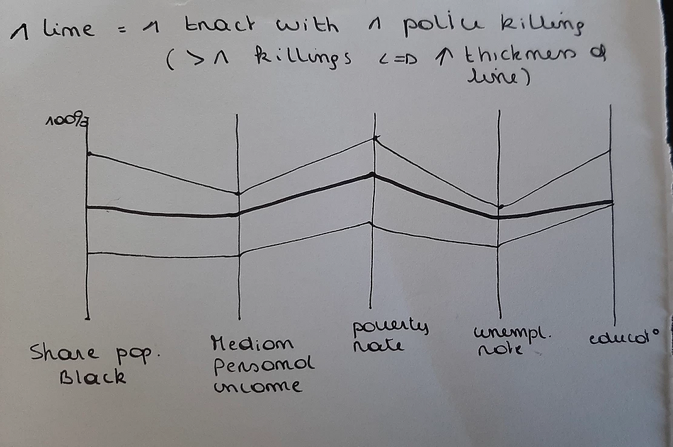
The "year clock": As this chart is consider is meant to show the temporal distribution of

attacks over the years and fatal casualties, it is in line with the time factor a the clock is a symbolism of time. However, it will be a bit difficult to relate with how the group intents to include the types of weapons used/fatal casualties with the different shades of color and also depict the variation in the attaches over the years. Almost the same information has been well presented in a trend graph at the emerging stage of their ideas as shown below. This will clearly show how the issues have been over the years and types of weapons used in committing these crimes. Hence, for easy and effective communication it will be appropriate for the group to replace the clock chart with the trend graph.

Change 2
The groups also intends to

show the the deadliest day of the year, together with the safe days (days where no attacks occurred) in a format as shown on the right hand side which seems to be a good idea. However, considering the number of days in a years and the variability in the days of the attack per year, it will not be visually appealing and effective to present the data in this format. However, the group may adopt a heat map to display the information for each year on a monthly basis. This is due to the fact that, each year has the same months making it easier for easy comparison. This will help readers to know the months risk months that attacks are carried out.
Change 3
At the final stage, the group tried to visualize what the targets are for different types of weapons in a form of a bar chart as shown at the righthand side.

However, I think it rather serve more purpose if the group show readers, security agencies and decision makers the type of weapon that is normally used in attacking each various targets by switching the axis of the chart such that the bars will be based on the targets while the chart fills will now be based on the type of weapon used.
Keep
Aside these few changes I think the group is good to proceed with all other charts
Pauline Van Camberg
Blog to review: "Data4Change", group 17
Link to their blog: https://data4change.medium.com/test-aa48ef8de592
Link to their Miro board: https://miro.com/welcomeonboard/McvSII59UGhdx5QNZcIudgvHZ0v95y2jjDjyZfrfBeH7xZCq7OG63U15JoFscHrh
Change 1

The theme being climate change, I find the tree diagram very interesting, with each branch representing one continent and one leaf on a branch representing a country of that particular continent. However, the representation of the CO2 emissions as roots of the tree puzzles me a bit. I would find it difficult to recognize countries if each country has its own root. Why not include this information by adjusting the size of the leaf (bigger leaf <=> larger CO2 emissions)? Another possibility would be to use one root by continent.
Change 2

Comparing countries based on different features (socio-economic criteria, level of pollution, or numbers of disasters) is a good idea but if I want to make an overall comparison of 2 countries, I have to look at 4 slices, which I find more difficult than just looking at 2 slices. Therefore, why not put all criteria for one specific country in one single slice? You could then divide your pie in 2 parts (left and right) to compare for example the most crowded and the less crowded countries.
Keep
I would keep the two previous representations, with some changes. But THE thing I would definitely keep is this:

This is a map visualisation to get a general overview of the data with colours indicating the type of disaster. I particularly like the possibility to click on the circle to get detailed information about that particular event and also the interactive time slider to discover the evolution of the natural disasters over the years. Ultimately, we can learn a lot from this!
Personally, instead of the changing temperature, I would represent CO2 emissions for each country by adding a colour gradient shading component, which also change over time.
Franziska Rüffer
Blog to review: "WHW", group 11
Link to their blog: https://medium.com/whw-notes
Link to their Miro board: https://miro.com/welcomeonboard/VcfBkaU8vAcLIz6oNlyrcAIvyeR5dTxLvkIK6pltyWfk4yrUnvz2XNCcExdZ3cQQ
So, now I have the honour to review the blog WHW Notes. With their project, WHW are looking at how trust and well-being are related in European countries. Without further due, let’s immediately get to the feedback.
Keep 1
The user interface is worked out nicely in the emerge phase, especially in terms of interactively combining designs from the diverge phase. Giving the user different options to select the countries or variables (s)he is interested in is very useful and avoids overloading the user with information. So this is a keep, for sure.

Keep 2
Definitively also keep the maps in the combinations, as this makes it easier for the user to keep an overview of the different countries. Something you might consider is adding the trust dimension to the map in this combination. This could be done by using different hues for the different countries. So, basically, you could also add HSK-18 for this, but instead of using different densities for the trust in parliament variable, I think it would be better to use hues, as it might otherwise look really crowded in combination with the pie charts per country. As I understand it, you have different trust variables, so maybe a filter can be used to select the different trust variables on the map.

Change 1
One thing you could consider to change is the way you explain your designs and their combination in your blog. When discussing combinations, you show several designs that you want to use in the combination but you do not discuss every design and its role in the combination. For instance, in the first combination, it is not really clear how LV19 is incorporated. In the second combination, how can bar charts surround a map of Europe? What happens to countries that do not lie on the border of the European Union?
Change 2
Secondly, this is not really a thing to change but more a recommendation to add. So far, there is only one design in your converge phase which is the hive plot that you already used in earlier phases. So, I would be thrilled to see new designs in your converge phase.
In general, keep up the good work and I am very curious to see how your project progresses and how you will implement your ideas! 😊


Comments