Intermediate progress update 1
- kofiagyabeng
- Apr 21, 2021
- 5 min read
Updated: Apr 22, 2021
Dear reader,
We are finally back with a substantial update on our progress. So sit down and grab a coffee or something because there's quite a bit to get through.
The merging of our datasets
First of all, we should briefly discuss our actual dataset. As you may remember, we intended to use (among others) data from FiveThirtyEight, our main dataset and data from The Washington Post (from now on referred to as the Washington dataset). Merging these two proved to be a challenge since information on these events was often inconsistent (e.g. different name spellings for the same person) or downright contradictory (e.g. different levels for certain variables for the same person).
Still, in order to fully answer our research questions, the variables from the main dataset are not sufficient. The Washington dataset adds a number of parameters of interest: whether the victim showed any sign of mental illness or not (binary), the presence of a body camera on the perpetrator (binary), and whether or not the victim fled (categorical).
In view of this, a unique identifier (tag) was generated in both datasets by joining the first names of each victim, age, sex, race and State. In a case where there are duplicates, the first letters of the victim’s city were added to the unique identifier.
After the creation of the unique identifiers (tag), The Washington Post data was merged onto the main dataset. We realized that some 80 people with their names/particulars in the main dataset were not recorded in The Washington Post, but we still kept them as part of the data. So now we have 387 matched and 80 unmatched observations.
This merging was done in Stata.
The flower plots
Now onto the main attraction.
Remember our petal plot that we wanted to use to give an overview of the victims’ characteristics like their ethnicity, whether they were armed, attacked, etc? We struggled a lot with finding a way to make this plot and fortunately came across a super helpful explanation on how this can be done in Tableau. Based on the instructions we found online, we ended up with a petal plot like in the picture below.


In the plot, you can see the number of victims of police killings in the US as represented by the size of the petals. The colours refer to the victims’ ethnicities as indicated in the legend. One issue with these plots is that the sizes of the petals do not correspond yet between the plots. And another issue is that this obviously does not look like a flower, let alone our initial design. After some tweaking, we finally managed to produce the visualization below.


Check out the link: https://public.tableau.com/profile/franziska.r.ffer#!/vizhome/PetalPlotPoliceVictims/Dashboard2
Again, the colours correspond to the victims’ ethnicity, the length of the petal shows the age of the victims as a ratio (victim’s age/max(age)). Each petal refers to a different victim and when hovering over the petals, additional information is displayed: the victim’s name, age, ethnicity, and the city in which the killing occurred. Initially, we also intended to add symbols for the victim’s gender on the edge of the petal. However, since the flowers already look quite crowded, we just added another flower to display male victims, which is the majority in this dataset.
What we can learn from this plot is that most victims are White and Black across all almost all categories. Compared to overall numbers, not a lot of the Black victims have mental health issues. When looking at the plot representing the victims that fled, one can see that the age of most of the victims is quite low since the blossom is smaller. This is also the case for the victims that attacked, while to a lesser extent. It could be that older victims are less fit than the younger ones, which is why they may not attempt to flee. Other reasons are also plausible, like being more self-assured and relaxed at a higher age. In most categories, it looks like the oldest victims are Whites while the youngest victims seem to be more often Black.
Like we already mentioned, the flowers are quite crowded right now. That's not surprising since we are representing our entire dataset within each flower. For the final implementation, we will be dividing the flowers up geographically. This will result in far fewer petals per flower, which will also most likely solve the overlap problem. (You might have realised that some petals are not visible due to being covered by other petals, since each new petal colour uses a new layer.)
What’s lying ahead for this design? We are not yet truly satisfied with this representation for several reasons. First of all, we initially planned to represent victims of the same ethnicity next to each other. Up till now, we still need to figure out how to do that. Secondly, we are planning to combine the map with the petal plot. For doing this, we probably need to implement the plot with another software. So, still a lot to do in the upcoming weeks. We will keep you posted on our progress.
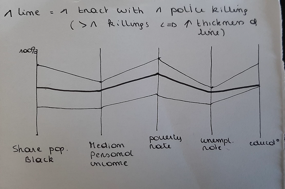
The map
Our intention was also to investigate how the social characteristics of the area were related to the number of killings that occurred in that area and to their characteristics.
Our initial idea was of course to use maps to locate these killings and use different colours to represent the levels of the social characteristic of the area, such as the poverty rate or the ethnic share of the population. You can find below an example with the county total population in 2015 as layer background. Additionally, when you move your mouse on a redpoint, which represents a killing, you get in a tooltip extra information on that killing, such as the age of the victim, the way they were killed, or the date of the killing.


Check out the link, it's pretty cool: https://public.tableau.com/profile/pauline.van.camberg#!/vizhome/map_21APR/Sheet1?publish=yes
We can extend this idea with other characteristics of the county (or the state), and why not consider adding several variables in one map: you would just have to click on the variable that interests you in the toolbar to make it appear! I know you're jumping up and down from excitement right now, but leave us some time to think about it …
Another way to phrase the question could be: “I want to have information on the counties where at least X victims were killed in 2015”. That’s also something we tried to do here: you choose the number of killings (a specific number or a range) and counties that satisfy this criterium appear. You can also filter by state.
The goal is to add some information on these specific counties but unfortunately, we still must do some research to get this data. Be patient, the best is yet to come!


Again, check out the link because the static version does not do our genius justice: https://public.tableau.com/profile/pauline.van.camberg#!/vizhome/map_21APR2/Sheet2
We mentioned before how we wanted to combine our beautiful flowers with a map in order to filter them geographically and thin out the density of petals on each flower. The maps here are all shown by county-level because describing this data on a state level would make the reader miss on a lot of nuances. Let's not forget how huge the USA is (Texas is more than half the size of the entirety of Europe). However, for our flowers, we probably can't represent it on a county level, given that a lot of flowers would have zero or one petal, which kind of defeats the point. So we might need to represent that data on a new map at the state level. We're still thinking of ways to do this and keep nuance within the same map.
In conclusion
You're still here, huh? What a trooper. But thank you for staying. We realise this update was a bit "crunchier" than what we're used to, but that's because we're really into the meat of the designs now!
Stay tuned for more and take care,
Ubuntu


Comments