Intermediate progress update 2
- kofiagyabeng
- May 6, 2021
- 5 min read
Updated: May 24, 2021
Dear reader,
Welcome back to our blog. The long awaited progress update is here.
The connected-line plot
Remember this old thing? All the way from our first concepts post?
No?
Well I don't blame you but let's refresh your memory a bit:
We'll first discuss the two original sketches and compare them to each other. We'll then explain how we combined the best of both of these for the final design. These sketches may look similar, but the subtle differences between them have important implications for their usage.
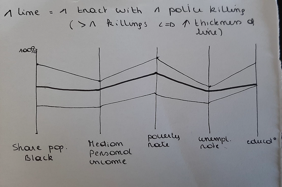
Sketch n° 1
The first one is a colourless design. each line represents a tract (an "area") with at least 1 incident. The more incidents there were, the thicker the line. The place where each line crosses the variable axes tells you the corresponding value of that variable for that tract.

Sketch n° 2
The second one uses colour. Here, one line represents one incident, not one tract. Analogously to the previous one, the intersection of each line with each variable axis reveals the value of said variable. However, here you have the additional colouring of the lines, which is coded based on one of the variables already present on the plot (here: "race").
Okay so what are the differences between these? An obvious one is that the first one contains area-level data, and that the second one contains personal-level data. But maybe a more important distinction is that n°1 uses thickness to add an additional continuous variable to the visualization (density of people), while n°2 uses colour to add an additional categorical variable to the visualization (ethnicity).
A combined version should do both. Sketch n°2 cannot add thickness to reflect an amount of people, because every line is a single person. So we have to add colour to sketch n°2. Sounds good on paper, but in practice it doesn't work out quite as well. There are roughly 73 000 tracts in the US. Our data set contains hundreds. Giving each line a thickness will make the plot hard to read. We need to reduce the number of lines.
Long story short, we came up with the following solution: use one line for each incident, like in sketch n°1, but only use categorical or discretized continuous variables. There will be overlap of lines, but adjust thickness to reflect the amount of incidents. This is all a bit vague but it will get clearer, promise.
We based ourselves off a design by Mike Bostock at https://observablehq.com/@d3/parallel-coordinates
You'll notice that this is almost exactly the design we made in sketch n°2. One observation, one line. The only difference is that his design cannot account for categorical data. If you were to add a categorical variable, then many lines would just overlap and you would get a perfectly symmetrical plot that doesn't really tell you anything (assuming every combination of two variables exists, which is definitely the case with our categorical variables). This can be seen in one of our middle iterations:

Satisfying to look at but not so satisfying if you want to learn anything: there is no way of knowing what lines contain more observations. That's where thickness comes in: lines representing stronger relationships must be thicker.
This is the key step in figuring out how to fuse the two original sketches: it uses the sketch n°1's method of thickening lines that contain more incidents, but does not do this based on a geographical area, but based on the strength of the relationship between two levels of two variables. This also has an important implication that makes this plot distinct from either of the two sketches: it is impossible to follow a single observation's line. If that's not all that clear yet I invite you to read further.
So here we have the final version. The quality is lacking because we're compressing an entire web-page's worth of image into a single picture that fits this blog so we urge you to check it out for yourself and play around with the variables here: https://observablehq.com/@mbrus/the-connected-lines-plot-final-implementation
Note that there are still some issues to be resolved, most notably the illogical order of the ordinal variables like "county_bucket".

So this plot allows you to do two things: read it with the colour, or read it without the colour. The thickness of the lines never changes. It is simply an indicator of the strength of the relationship between two levels of two variables, regardless of what third variable you selected. For instance:

Regardless of the selected variable (indicated underneath each plot), the thicknesses remain the same: Most victims that did not suffer from mental illness did not flee either.
So what does colour add to this design?
Let's go over an example:
Select the variable of interest in the upper left corner. Now each level of this variable will get a colour. Here I selected "mental illness": yes is blue, no is red. We can now check the variables "armed". For the firearm level, we can see that the line connecting to county_bucket 1 is the thickest of the five, indicating that the largest group of armed victims was the one in the lowest income quintile. You can also see that the lines connecting firearm to the five "county_bucket"-levels are mostly blue-ish. This means that the majority of people that had a firearm scored yes on the "mental illness" variable. If you then check the knife level, you see a mix. The line connecting knife to county_bucket 2 is reddish, so the majority of people that were armed with a knife and were in the second income quintile scored no on the "mental illness" variable.
In conclusion: This plot is useful for comparing the relationship between two variables, as a function of another (prespecified) variable.
The map
Since our last blog post, we’ve learned and worked and a lot to improve our visualizations: we’ve spent a few (many?) hours to get familiar with JavaScript, especially with D3.js and svelte.js, which are two JavaScript libraries used to produced interactive data visualizations in web browsers. We’ve also collected some more socio-economic data at the county level (unemployment and poverty rates, education al level, ethnicity share etc.).
Anyway, let’s come back to our US map! Here’s an overview of what it looks like in our browser when we use D3.js:
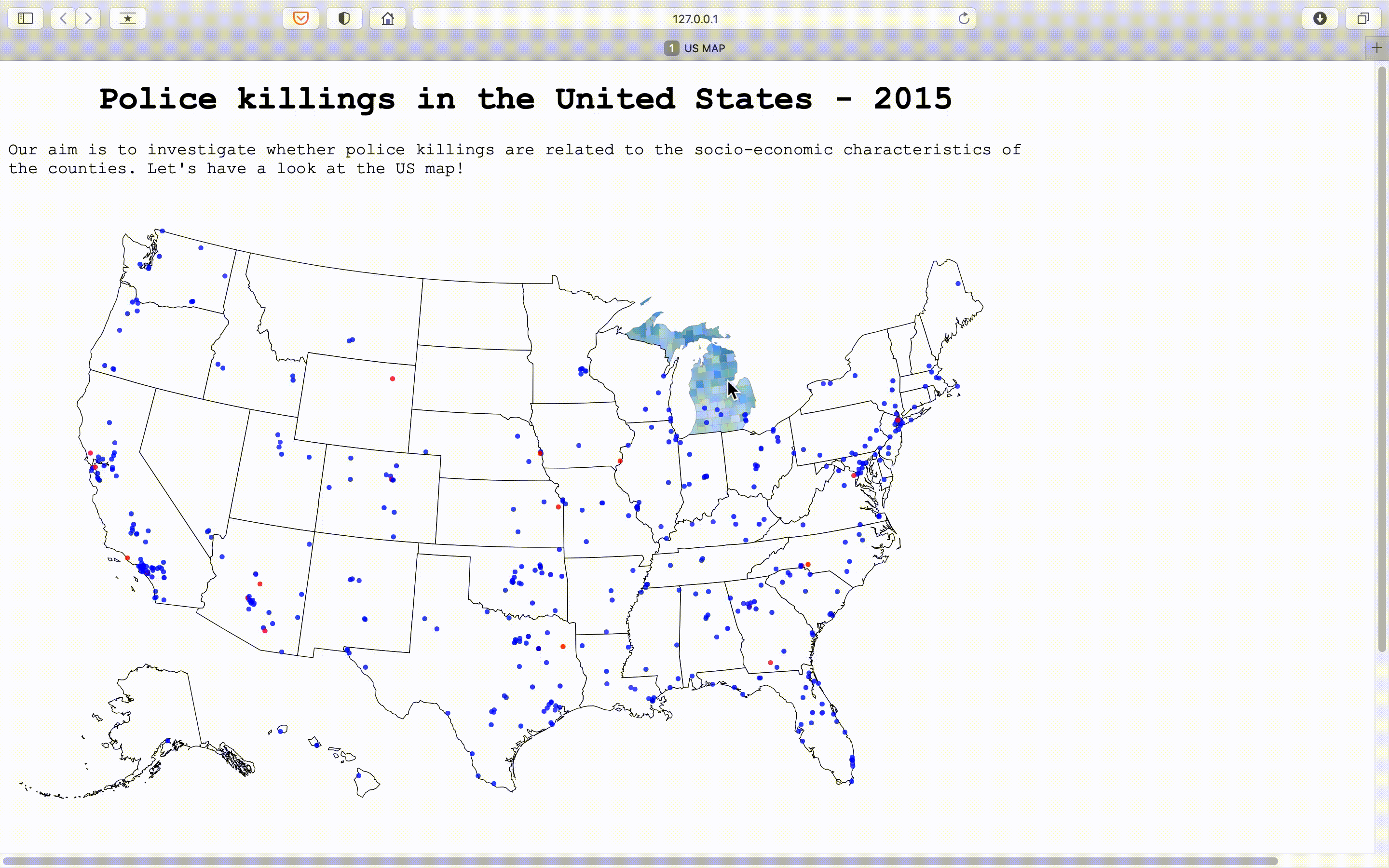
Killings (blue and red circles, depending on the sex of the victim) are displayed at the place where they occurred. Nothing new. But NOW, as you can see in this short video, when you hover your mouse pointer above a state, counties of that space appear, with their color representing their level on a given characteristic (here, the unemployment rate, and, indeed, the legend is still missing). We also incorporated a zoom function.
However, our d3.js journey is not over yet because we still must add some features to this map. We’d like to:
- Add a dropdown menu to select the socio-economic characteristic of interest.
- Add a color legend.
- Add a “click” function to have an overview of all counties at once.
- … more ideas are coming …
And of course, our ultimate goal is to combine this map with our wonderful flowers. But give us a little more time, we are working on it!
Thanks for reading and stay tuned,
Franziska, Pauline, Kofi, and Marius


Comments