Welcome to our first project
- kofiagyabeng
- Mar 20, 2021
- 3 min read
Dear reader,
If you ever picked up a phone or looked at a TV in the last year it is unlikely you missed the discussion on police violence that secured the number 2 spot for most talked about topic of 2020 (right after a certain event that shall not be named). You probably witnessed how fast the debate can get inflammatory, which reveals how passionate many people are about this topic. This is understandable. After all, this debate calls into question the role of law enforcement, which is one of the main institutions that define the structure of our society. The discussion has been very US-centric, but its effects can be felt across many parts of the world too.
Protesters gather on Place de la Republique to demonstrate against the controversial global security law undergoing parliamentary approval, in Paris, France, 28 November 2020. [Christophe Petit Tesson/EPA/EFE]
As for any hot-topic discussion, the importance of factually correct information is crucial in the forming of personal and public opinions. Unfortunately, accessing this information isn't always straightforward, and neither is interpreting it. You will have seen the damaging results of poorly-informed debate on television, or if you're unlucky, on your family's Facebook group. Now most of us are pretty confident that we're well informed, because how could we know what we do not know? We may want to go out there and do our own research, but many of us do not have the tools, the knowledge, or the time to do that.
Turns out there is a group of four statistics students with tools and knowledge aplenty*!
*the "time" part was not left out by accident. But hey 2/3 isn't bad.
Let's get the obvious out of the way first. We're not the first to make comprehensive visualisations of data on police killings. Not by a mile. Many reputable sources have done so already.

Mappingpoliceviolence.org has a very complete database
Our goal is a bit different. Instead of scrambling together every known case of police violence, we will be focussing on a smaller dataset, but one with many more variables. Instead of a list of thousands of cases with just a name, sex, and race, we will be dissecting a few hundred and answer more novel questions.
How did the frequency of killings vary among personal characteristics of the victim?
How did it vary among social characteristics of the victim?
What were the circumstances of the killings?
Are these killings in any way related to social events like elections or protests?
To achieve this, we will be crossing several datasets from The Guardian, The Washington Post, The 2015 US census, The 2016 presidential election data, and the ACLED. The result will be a high dimensional dataset. Note that we will be discussing police killings exlusively. It goes without saying that a lot of police violence cases do not involve a fatality.
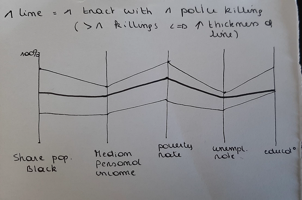
Our aim will be to make an intuitive visualisation so that you can develop a more complete understanding of how many of these regrettable events happen. While our project will not provide any conclusions, we hope it will broaden your view on the issue.
Our main dataset, courtesy of FiveThirtyEight, can be accessed here:
https://github.com/fivethirtyeight/data/tree/master/police-killings
The data from the Washington Post can be accesses here:
https://www.washingtonpost.com/graphics/investigations/police-shootings-database/
The data from ACLED can be accessed here:
https://acleddata.com/dashboard/#/dashboard
The data from the 2016 presidential election can be accessed here:
https://dataverse.harvard.edu/file.xhtml?persistentId=doi:10.7910/DVN/VOQCHQ/HEIJCQ&version=6.0
Stay tuned for frequent updates and take care,
Franziska, Pauline, Marius, and Kofi


Comments